By Deborah Shaw
Way back at the start of 2021 I spent two weekends at the  University of Otago’s Otakou Press learning the fundamentals of letterpress printing. Printer-in-residence Dr John Holmes and his assistant Shef Rogers took five of us through the basics, and by the end, we’d printed pangrams (phrases that use every letter in the alphabet), sonnets and projects of our own.
We started simple: print our own name tags. Sue was glad she only had a three-letter name, but she quickly learned that, for centring the text, short names required more em spaces, which were in short supply. I initially printed my name as “Dedorah”. I felt like I was back at primary school, learning to write.
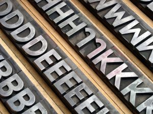
With the basics down, we worked on pangrams – phrases that use every letter in the alphabet. Working upside down and back to front, we loaded our composing sticks with type. p’s and q’s, b’s and d’s, u’s and n’s had me doing mental gymnastics to check I’d put the right letter in the right way around. I’d be sure I had the p in place, only to make my first print and find out it was a q. Cue bending over my galley with tweezers as I surgically extracted the incorrect letter without upsetting the whole line. Eventually, I ended up with my pangram, the alphabet in upper case and lower case, and symbols all nicely centred on wonderfully textured paper. The ligatures were my favourites.
As I worked, all these familiar publishing terms came to life. Leading, the space between lines of type, is literally strips of lead. Your type sits in the galley, which is where your galley proofs come from. Em spaces are square and about the width of a capital M; en spaces are half the width of an em.
I knew that a lot of the typographical terms we use in digital publishing come from letterpress printing, but physically holding the leading and carefully placing all the em spaces made those terms real. Technology moves forward, and the language sticks.
Once we had our galley proofs printed, we proofread. Proofreading on newsprint was a vastly different (and more stressful) experience than proofreading digitally. No matter how many times we combed through Jasmine’s pangram, we didn’t spot the typo until she’d printed ten copies on good quality paper. When she printed her own project, Ode to Typesetting, she deliberately inserted a typo, just to keep readers on their toes.
Working with type prompted a cognitive shift. Today’s galley proofs often come in the form of digital PDFs, but we still call them galley proofs. Likewise, the phone emoji looks nothing like the phones we use today (outside of offices, perhaps). Our collective memory tells us this ☎️ is what a phone is, even if some of us have never used a phone like it.
I came away from the course with a greater appreciation for the arts of typesetting and design, and just what technology can do for us. MS Word has its foibles and InDesign is daunting, but with both I can justify text with a click, rather than painstakingly insert spacing with one hand while trying not to upset the type with my other hand.
By the end of the second weekend, I’d become pretty fast at finding my type and sliding it into my composing stick. Putting the type back was another matter. My apologies to the next person who uses the tray of size 12 Garamond. Some of those d’s and b’s might be in the wrong boxes.
I tell my authors there’s nothing like holding your book in your hands for the first time. I felt the same way with my projects, and my pangram, “Pack my box with five dozen liquor jugs”, is now framed on my office wall.
Deborah Shaw
contact@deborahshaw.co.nz
